Thursday, January 6th, 2011
Practicing local SEO is not going to be effective if your customers aren’t led to a web site worth reading through or buying from. If you want your local business web site to reach the maximum amount of potential customers then you need strong, effective web design. You must be sure that your business web site is developing successfully. In this article I will give you seven simple tips for effective business web page design.
1. Don’t use welcome pages
Welcome pages are pages that you sometimes see when you try to view a web site. They are usually bright and have a big picture and an invitation to visit the site such as: “Welcome” or “Enter” on them. Avoid such pages. In reality they often annoy users and so you can loose some potential clients. The users should see the content of your web site from the first sight. Remember, welcome pages are never used in effective web design.
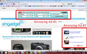
2. Don’t use annoying ads
Too many glaring ads can clutter up a website and really disrupt your visual appeal. Take a look at this screenshot example:

Most of the users ignore such advertisements on web sites. Try to use quality materials with some advertisement inside instead of annoying banners. As a result users will click on the links more often. Only professionally designed ads don’t annoy and are successful at the same time.
3. Navigation must be easy and understandable
You must create such navigation that even a child could easily orientate on your web site. Avoid dropdown menus based on scripts or flash. If the users won’t immediately understand, how to orientate on your web site, they would leave. Remember, that an easy and convenient navigation is one of the first signs of good web design.
4. A user should always understand in what part of your site she is in now.
Firstly, your navigation should be seen from each page of your web site. When the user makes a few clicks on your site, he should still understand in what part of your site he is now and how he can get to any other par he wants. This will make the search of information on your web site easier and a good web design is always convenient for users.
5. Text must be easy to read
Separate your text into small paragraphs. If there is a lot of text on the page, divide it into small blocks. Remember, good web design is always user-friendly.
6. Don’t use sounds on your site
If the user is going to stay on your web site to read some interesting material, don’t use sounds or music because it can annoy some users. If you still want to use sound effects, use them so that the viewers of your site could control the volume or turn them off.
7. Be sure your web site corresponds to modern web standards
While creating your web site you should pay attention that it must correspond to web standards and be correctly displayed in all main browsers. If your site looks great in Internet Explorer, but can’t be viewed or is displayed incorrectly in Firefox or Opera you will loose a lot of clients. Your site should work in all browsers.
It really does pay to have an attractive, quality website first and foremost. When you have a solid and effective website it makes local SEO tactics that much more rewarding and successful.


